Six Degrees of Separation: Linkedin Mapped
Bootcamp: Network Maps * Nov 7th
As a Moretti fan, I was already looking forward to this week’s readings: Network Theory, Plot Analysis. Even though Moretti generally works on texts, I find his affinity towards quantitative tools parallel with mine. And, while I was reading it – I kept wondering how it could be applied elsewhere, to the non-textual.
“This paper is the beginning of an answer, and the beginning of the beginning is network theory. This is a theory that studies connections within large groups of objects: the objects can be just about anything – banks, neurons, film actors, research papers, friends…-and are usually called nodes or vertices; their connections are usually called edges; and the analysis of how vertices are linked by edges has revealed many unexpected features of large systems, the most famous one being the so-called ‘small-world’ property, or ‘six degrees of separation’: the uncanny rapidity with which one can reach any vertex in the network from any other vertex.” (Moretti, 2)
Moretti states here that the network theory can be applied to anything, any object and how plotting them can reveal ‘many unexpected features of large systems’ akin to the ‘six degrees of separation’ game, but visualized. This got me thinking. Previous readings in class have me keenly aware of my own place within the network we’re identifying, so I wondered about networks I am within? Social networking seems obvious. Professional networking, sure. Ah, Linkedin.
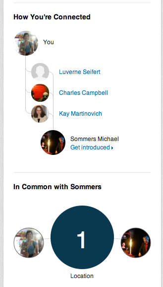
I don’t use Linkedin much. I signed up a few years ago after a flood of invitations from my friends but wasn’t quite sure how to use it – partially because its not really geared towards me, or rather, puppeteers. But it’s a pretty literal application of the ‘six degrees of separation’ theory more than Facebook or other social networking platforms. By literal, I mean they literally put what degree (how many edges) you are separated by a potential connection’s (node/vertices) on that person’s profile (upper right hand corner).
The network mapping goes on:
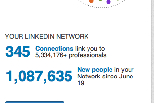
In their version of the ‘six degrees of separation game’, I may only have 345 literal connections but there are five million three hundred and thirty four thousand one hundred and seventy six people in my network!!! Utter ridiculousness.
I searched further into my linkages, but reading about 5,334,176 connections, even 345, is too big a number for me to ‘see’. So, how can I visualize this entire network?
Big surprise: there’s an app for that.
Visualize your Linkedin Network video
As the narrator states, everyone’s most common question is ‘what does my network look like’? Because, there is power in the visualization.
“No, I did not need network theory; but I probably needed networks. I had been thinking about Horatio for some time – but I had never ‘seen’ his position within Hamlet’s field of forces until I looked at the network of the play. ‘Seen’ is the keyword here. What I took from network theory were less concepts than visualization: the possibility of extracting characters and interactions from the dramatic structure, and turning them into a set of signs that I could see at a glance, in a two-dimensional space.” (Moretti, 11)
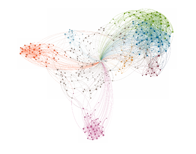
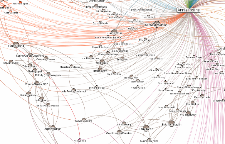
So, I mapped my network.
There’s obvious clustering, a few tendrils and almost no symmetry (or none that I can see). Strangely, the app color-codes the clusters but it’s up to me to label them. This is an interesting question. You’d assumed they’ve plotted them because of information they already have, their six degrees database, so why not suggest to us how they made the map? Why leave it up to us to categorize the people?
At a glance, it seems to be a simple geographic plot – all my acquaintances from my time in California are all on the left of the screen, and all my connections from my MFA in Minnesota program are all the way to the right, etc.
And while geography has a lot to do with it – it’s really who knows who, right? They’ve taken everyone else’s network into account as well and linked those people that know each other closer together. Like Mark Newman’s clustering theory: “If vertex A is connected to vertex B and vertex B to vertex C, then there is a heightened probability that vertex A will also be connected to vertex C.” And, in this day and age, geography still has a great influence on who knows who/clustering.
Most interesting is where the data gets confused: the grey color seems to be nodes they don’t quite understand.
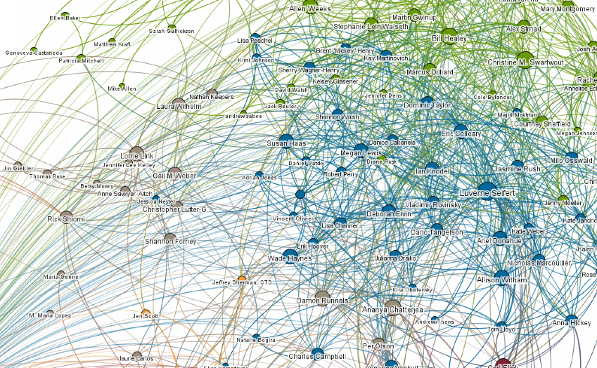
The grey nodes linger in limbo and are scattered in all corners – close to me, but floating. Some are linked peripherally to a few of my clusters, not just one. Many of them are puppeteers (we run in random/multiple circles?) or close friends. Two of these grey nodes are my sisters – Linkedin can’t see the familial and personal relationships, so they’re confused as to why I have a labor lawyer and insurance R & D connection in my network. It only maps our professional edges. It also doesn’t take into account the simple fact that people who use linkedin more will automatically be better connected to their networks. The largest nodes/highlighted names in the map are definitely people who use Linkedin regularly and are best connected within my networks.
Even with these limitations, I love the clarity and the swiftness of the information here. I do see ‘unexpected features of large systems.’ The weeks I saved using the database to map my network instead of my own hands/heart/brain is an incredible thing. Linked In knows this too and they’re capitalizing on this desire for an ability to visualize our network in a multitude of ways. It’s strangely beautiful isn’t it? Beautiful and informative. I, too, am “always impressed by their explanatory power.” (Moretti, 11)
References:
Deleuze, Gilles, and Félix Guattari. Rhizome: introduction. Paris: Éditions de Minuit, 1976. Print.
“LinkedIn.” Wikipedia. Wikimedia Foundation, 11 Apr. 2013. Web. 4 Nov. 2013. <http://en.wikipedia.org/wiki/LinkedIn>.
Moretti, Franco. Network theory, plot analysis. London: New Left Review, 2011. Print.
“Rhizome (philosophy).” Wikipedia. Wikimedia Foundation, 15 Oct. 2013. Web. 4 Nov. 2013. <http://en.wikipedia.org/wiki/Rhizome_(philosophy)>.
