The post Bootcamp: Lorenzetti’s Allegory of Good and Bad Government appeared first on &.
]]>For this bootcamp, I wanted to see what Moretti’s network theory could bring to my own research, and more specifically to the interpretation of visual texts related to law and justice.
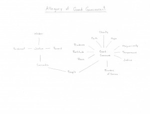
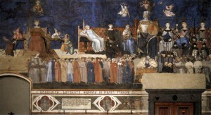
I chose to look at a group of three 14th century frescoes painted by Ambrogio Lorenzetti: the Allegory of Good and Bad Government, located in the Town Hall of Siena. Since they are fairly complex paintings containing numerous characters, I thought that a diagram might be useful to shed light on the relations between the symbols. I first focused on the main central fresco. Since I still feel more comfortable with paper and pencil than with fancy software, I did it granny style.
 In this diagram, the nodes are obviously the characters in the allegory, and the edges represent the connections between them. I simplified things a little bit, leaving aside for instance the soldiers and prisoners in the right lower corner.
The diagram makes evident some connections that the viewer of the fresco could easily miss if he or she didn’t pay close attention to the details. The cord that is handed down from the scales (held by Justice) to the People is, in fact, a fairly explicit edge. But there are a number of additional and more implicit connections between the characters that the diagram reveals. For instance, Justice is connected to Good Commune, but only indirectly: the link passes through the People. According to a common interpretation made by contemporary art historians, it runs from Justice, via harmony (Concordia) through the People, which are thus both guided and held in check, to Good Commune. But looking at the diagram, one could ask whether the direction of this edge could be reversed, running from Good Commune to Justice. In other words, the diagram incites us to ask more fundamental questions with respect to power relations.
Another set of relations revealed by the diagram is the one concerning the six virtues sitting around Good Commune. They are all connected to Good Commune, but not to each other, and also not to the main Justice figure to the left. The diagram also highlights the fact that Justice appears twice in the same fresco, and that the two representations are not directly related to each other. Does this duplication imply that justice was the dominant virtue at that time? Interestingly, the main Justice figure to the left is the only character related to Wisdom. This suggests that wisdom was, in the 14th century, considered essential to deliver justice but, since the node of Wisdom is not directly related to the node of Good Commune, not fundamental to the exercise of good government itself.
As Moretti suggests, we can also make experiments by playing with the diagram; variations may indeed be enriching. I didn’t re-draw the diagram in each case, since, thanks to Moretti’s own experiments, it’s quite obvious how this would look like in our case. What happens if we remove one of the virtues? Or if we get rid of the main Justice figure to the left? How would then good government be exercised? Remember that Wisdom disappears with the removal of this Justice. And what about if we eliminate the People? It is, after all, the very purpose of Justice and of Good Commune that would disappear. What would be the effect of getting rid of the central fresco? How do the allegory and effects of bad government (the fresco to the left) relate to the effects of good government (the fresco to the right)?
Notwithstanding these insights, there are important shortcomings to using network theory to analyze relations between numerous characters and symbols in an artwork. By way of example, the analysis of how the nodes are linked by the edges in Lorenzetti’s allegory has not revealed totally unexpected relations. This is probably linked to the fact that my analysis, similar to Moretti’s analysis of Hamlet, misses vast quantities of data; these frescoes clearly don’t contain large groups of objects necessitating quantitative analysis. Moreover, although not as explicit as a diagram, the frescoes are already visual representations.
We also have to be careful when trying to draw, from these frescoes, definite conclusions that are then converted into the diagram. Interpretation plays an important role. In the 18th century, for instance, the figure sitting on the throne to the left was thought to represent the city of Siena, and not Justice. And initially, the group of frescoes was called Peace and War; it’s only centuries later that the name changed, when good government itself became an important notion. In other words, there are alternative ways of reading these frescoes, something that the diagram does not reveal.
Furthermore, the diagram does not allow us to comprehend the overall symbolic importance attached to good government. There are two entire frescoes dedicated to good government (the allegory of Good Government and the Effects of Good Government), whereas bad government gets only one fresco combining the allegory and the effects. The frescoes are located in the room where the city councilors met; these frescoes were obviously meant to remind them of the consequences of their decisions and to influence them in a positive way (therefore the greater importance given to Good Government). But am I too concerned with close reading here?
Finally, I am wondering whether the conception of justice and of good government more generally is well represented in a diagram. It probably works in this European context, in other words in a context infused by Western thought. Following the discussion in Deleuze and Guattari, it could be speculated that in other cultures, justice might be better represented by other visual tools, as a tree or a rhizome, for example.
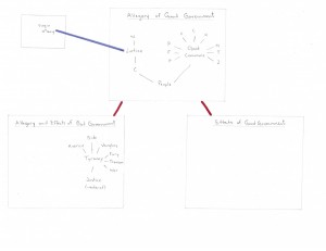
To try to gain more insights from applying network theory to my research, I thought I should expand my initial diagram. I therefore tried to represent the links between the three frescoes in another, even more simplified, diagram.
Hmmm. There are certainly many links to be made between the nodes in the different frescoes – an obvious one would be between the “strong” Justice figure in the central fresco and the “weak” Justice figure in the fresco to the left. But somehow I feel that it would be too arbitrary to try to make all these connections. Although there are definite connection between the frescoes, i.e. between the Allegory of Good Government and its Effects, only the fresco to the left contains further allegories and therefore more easily identifiable nodes.
Moreover, there are other paintings related to these three frescoes. There is, for instance, a painting of Virgin Mary in an adjoining room that is usually seen as being connected to the main Justice figure in the central fresco. The resulting interpretation is that the two women – Justice and Virgin Mary – are seen as reigning over the city of Siena. What about other paintings in the City Hall, and elsewhere in the city of Siena?
I would say that although its usefulness is very limited, the second diagram reminds us, once again, that making diagrams involves a lot of subjectivity and interpretation.
In sum, I believe that a few interesting connections and insights have emerged from drawing these diagrams of the Lorenzetti’s group of frescoes. But I am still not convinced of networks as an appropriate re-visualization style of representations, such as paintings and photographs. I certainly need to rethink how exactly Moretti’s network theory could be more helpful and meaningful in this context, and how an analysis of quantitative data could complement the more qualitative interpretation of visual representations.
Bibliography
Deleuze, Gilles, and Felix Guattari. “Introduction: Rhizome.” A Thousand Plateaus: Capitalism and Schizophrenia. Trans. Massumi, Brian. Minneapolis: University of Minnesota Press, 1987. 3–25.
Dessi, Rosa Maria. “L’invention du « bon gouvernement » – Pour une histoire des anachronisms dans les fresques d’Ambrogio Lorenzetti (XIVe-XXe siècle).” Bibliothèque de l’École des chartes 165 (2007) 453-505.
Moretti, Franco. “Network Theory, Plot Analysis.” Literary Lab Pamphlet 2. May 1, 2011. [Orig. pub. New Left Review 68, March-April 2011]. http://litlab.stanford.edu/LiteraryLabPamphlet2.pdf.
The post Bootcamp: Lorenzetti’s Allegory of Good and Bad Government appeared first on &.
]]>
